

ENDEAVOR
Visual Identity
OBJECTIVE
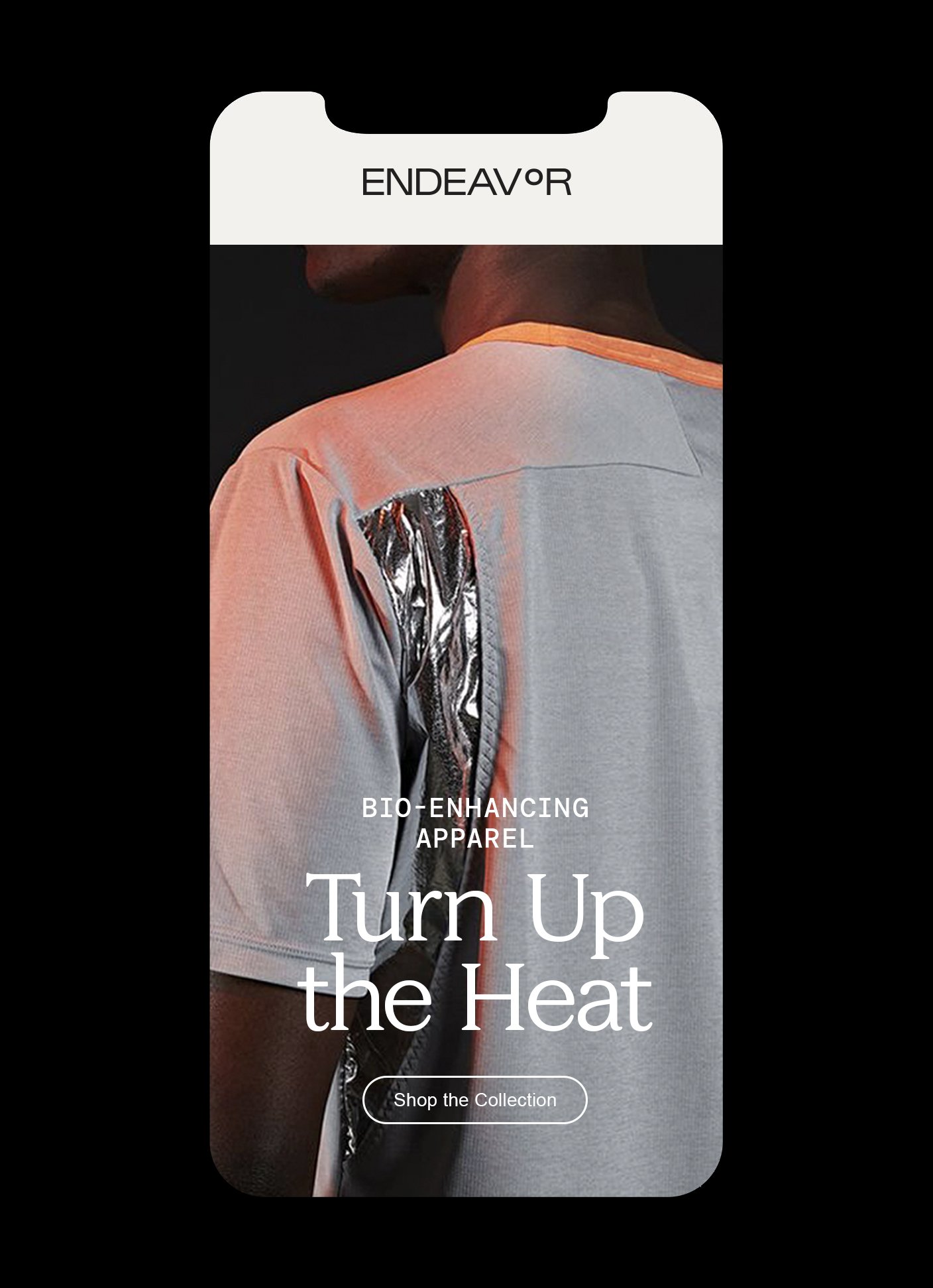
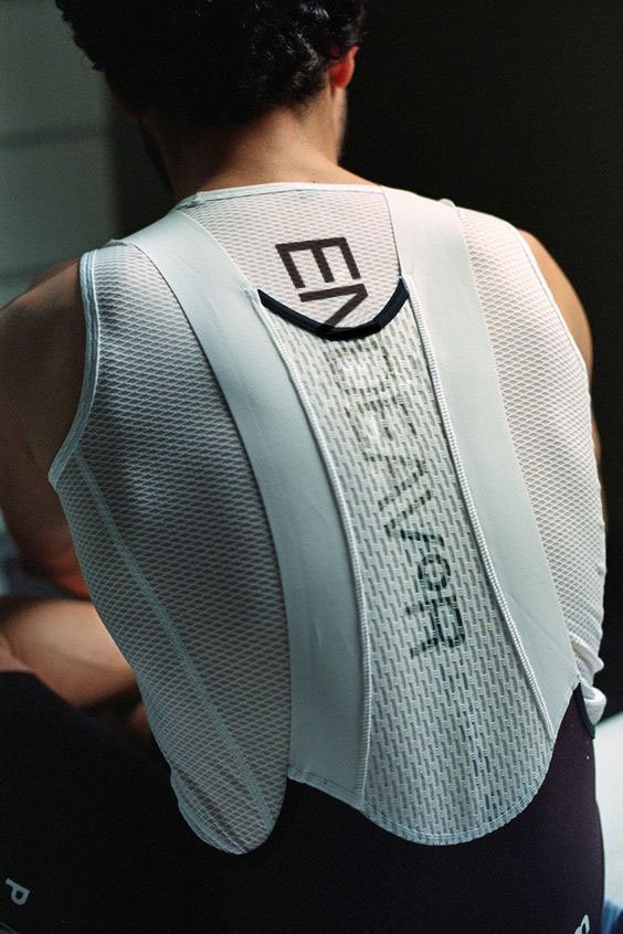
Endeavor Athletics empowers individuals to unlock their full potential through the use of bio-enhancing and thermo-regulating apparel.
The ongoing quest to radically transform oneself and access our highest potential is a uniquely human experience and the foundation for Endeavor Athletics. With this commitment to the pursuit of self-actualization, we built a creative foundation for Endeavor 2.0 that manifests in physical and spiritual language. Endeavor is an exploration of extremes – it is technical and ethereal, restful and explosive, familiar and futuristic. Through the use of a color palette inspired by our earth’s core, the juxtaposition of feminine and masculine forms, and elegant yet technical letterforms, Endeavor was reborn.
ROLE
Identity
Art Direction
Creative Direction
Concept Development
Apparel
Creative Strategy


Anchored by the degree.
The degree symbol is a central part of Endeavor’s product design and visual identity. Developed to be an essential part of the logo mark, as well as an element to be used throughout printed and digital work, the degree helps to contain, emphasize and highlight content. Further, the degree symbolizes Endeavor’s pursuit of the ideal temperature state and serves as an aperture to the soul.

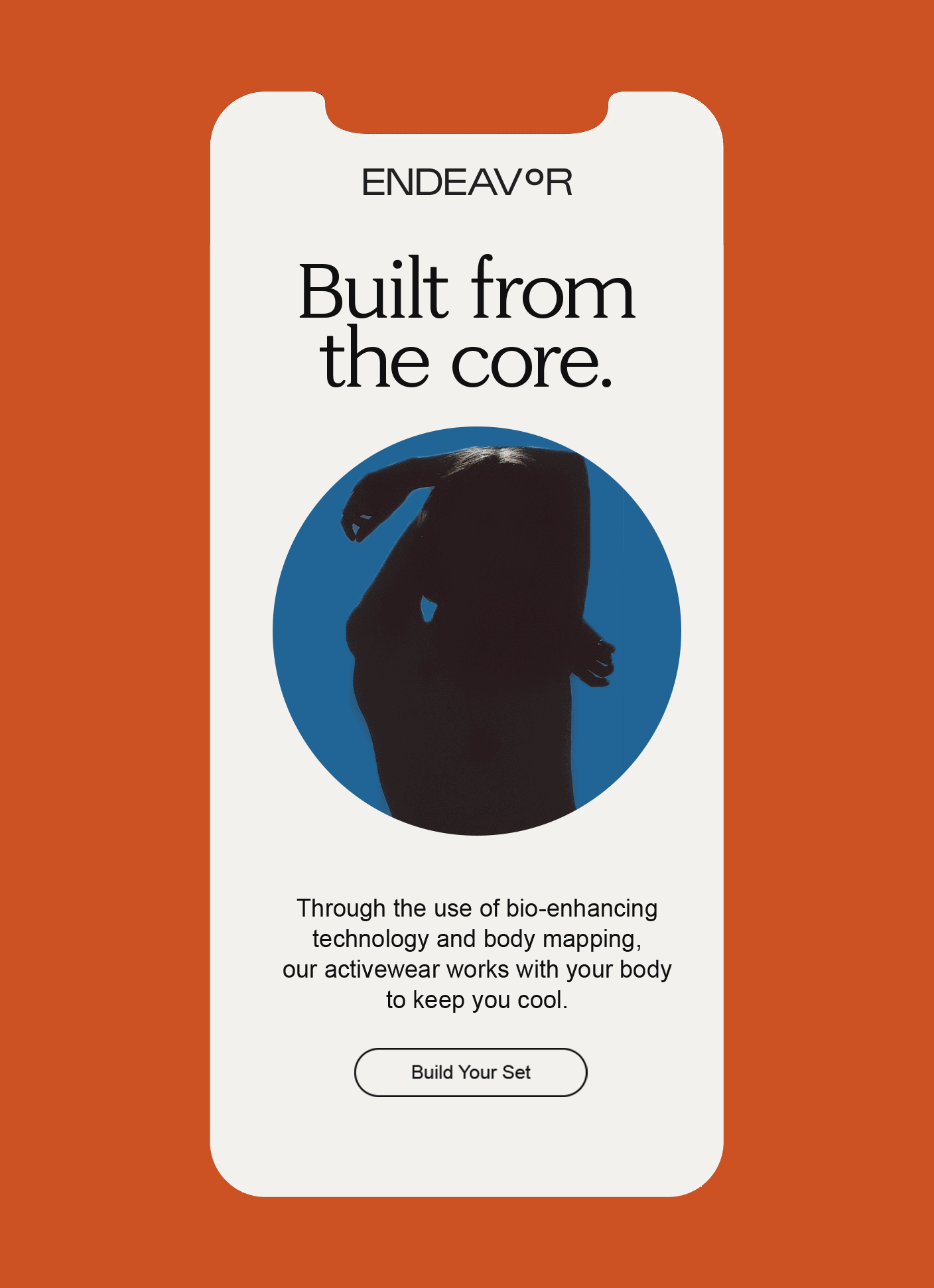


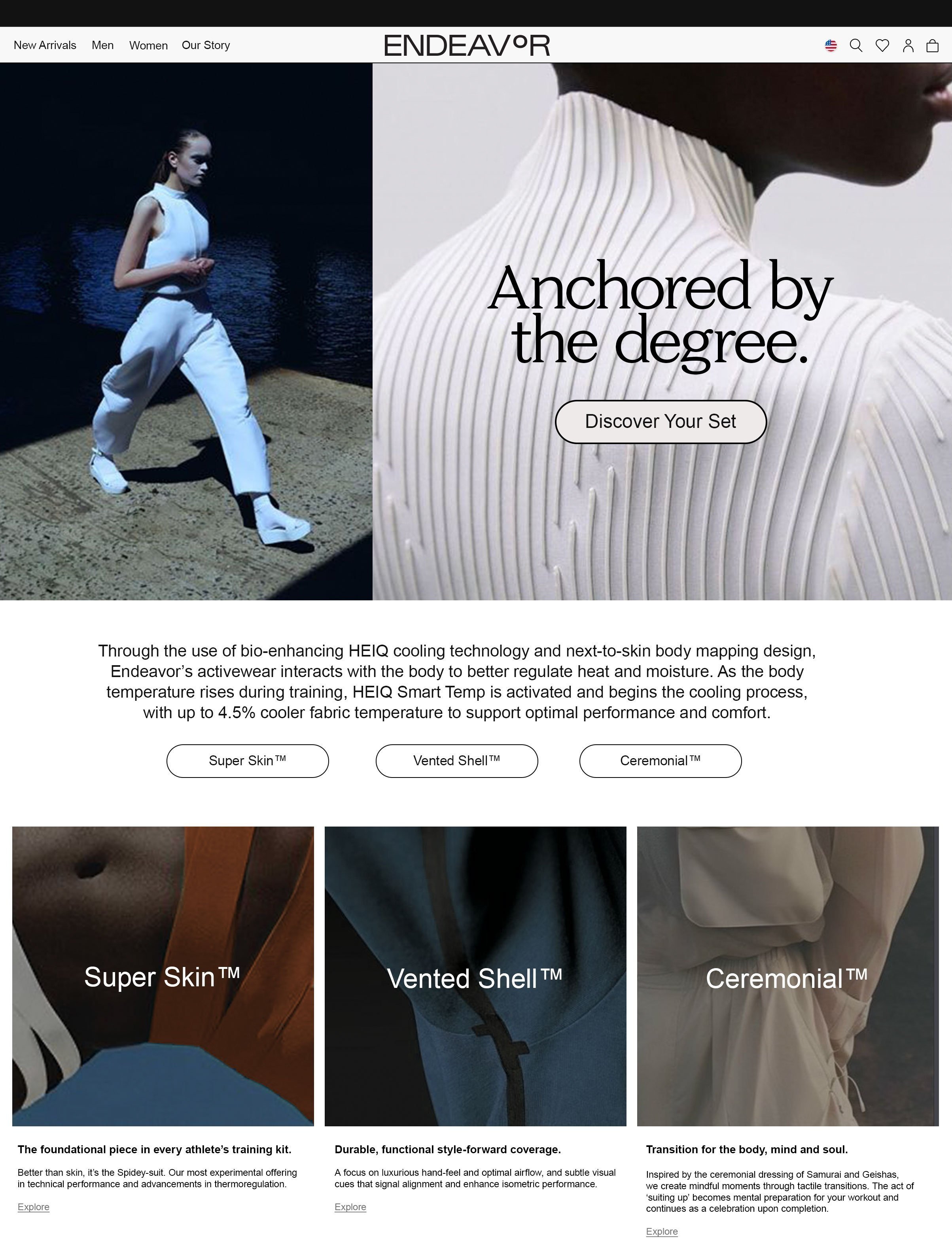
Inspired by our earth’s core and thermo-mapping, the Endeavor color palette is visceral and elemental. Bold and saturated hues are contrasted by dark and misty neutrals, layering in elegance and sophistication. Drawing from our life source, our earth’s core, this palette is the fuel and fire that drives us – one that must also be honed and regulated.

The colors.


CREDITS
Agency: MGARRY&sons
Creative Director: Elizabeth McGarry
ALL IMAGERY IS REFERENCE ONLY.